Tuesday, December 8, 2009

Walker Evans Series Drafts


For both construction pictures, I was trying to get a shot of a place that looked wrecked and deserted. This is similar to what Walker Evans did with some of his pictures. I was trying to get a good shot of the powerlines in the first picture and a good shot of the bulldozer in the second picture in order to have a good focus for both pictures. I was also trying to get a good background lighting in the first picture because in one of Walker Evans' pictures, he has a shot where the lighting in the background is brighter than the lighting in the front.


For both of the pictures of my house, I was trying to get a picture that was straight on with no angles. This was similar to what Walker Evans did with a couple of his house pictures. Like in my pictures, the houses in his were pretty close up with the focus on the center. What's a little different about my house pictures is that his background is literally in the background where as in my first picture, the background is reflected from the window of the door. In my second picture you can see a bit of a background through the top window.


For the picture of the street corner, I was trying to make it similar to a specific picture that Walker Evans did of a deserted street corner. Like Walker Evans, I was trying to make it look like it was a poor town and that hardly anyone lived there. Unfortunately it was difficult to avoid getting cars in the shot while taking the picture.

For the picture of the movie theatre, I was trying to get an example of the types of structures that Walker Evans used in his pictures. Like this one, his buildings are made up of old looking wood. Also the blue paint on the theatre makes it stand out from everything else. I was also trying to get a good shot of the background.

For the picture of the Tiburon shop window, I was trying to get a good shot of the sign in the window. This was similar to what Walker Evans did with many of his sign pictures. Like Walker Evans, I was trying to make my signs have a message. The message that I had in my signs was that this one said, "For Lease" and a picture of another shop window that I took said, "Leased." Unfortunately the second picture didn't turn out very well, so I didn't upload it.
For the picture of my christmas lights, I was trying to get a good shot of bright lighting with a dark background. This was similar to what Walker Evans did in one of his pictures of Times Square in New York. I was also trying to get a good shot of the lights that are in the background of the picture.

Walker Evans Research Project - Part 2

Photojournalism began in the mid 1800s. Events that were considered news were photographed at first and printing presses used engravings until the 1880s. Innovations in photography led to the printing of photographs on presses by 1897. The “golden age” of photojournalism went on between the 1930s-1950s. Some newspapers and magazines were popular because of the photography. Life Magazine was considered to be one of the most read magazines between 1936 and the early 70s. It exposed a great deal of people to photojournalism. Photojournalism and documentary photography are considered as a form of art today.


Documentary Photography is a type of photojournalism that focuses on a certain subject. The purpose of the photographs is to show the reality of the subject and teach the viewer about places, people or a time in history.


The main artists in the photojournalism genre are Carol Szathmari, Kenneth Kobre, Don McCullin, Susan C. Zavoina, John H. Davidson and Grahan Clarke.
The main artists in the documentary photography genre are Berenice Abbott, William Eggleston, Robert Frank, Lee Friedlander, Jim Goldberg, Nan Goldin, Lauren Greenfield, Lewis Hine, Dorothea Lange, Mary Ellen Mark, Steve McCurry, James Nachtwey, Gordon Parks, Eugene Richards, Jim Richardson, Jacob Riis, W. Eugene Smith, Gary Winogrand and Sally Mann.
Walker Evans was the first photographer to make art from something that did not appear to be art. “His work embodies a way of seeing that at once is entirely Evans’ and stands upon him.” His work was considered an important part on American documentary photography. He was considered a genius in his ability to show the reality of The Depression in this art form. He was against photographs that were too commercial or artsy.

End Notes:
Quote 1: http://en.wikipedia.org/wiki/Photojournalism
Photo 1: http://myjournalism.files.wordpress.com/2009/03/photojournalism_002.jpg
Photo 2: http://sarahwichlacz.com/wp/wp-content/uploads/2006/05/docume2-1.jpg
Photo 3: http://www.docuphoto.com/images/activists/200x300/activist.jpg
Book 1: Walker Evans 55


Walker Evans Research Project - Part 1

Name: Walker Evans


Walker Evans was an American Photographer. He was born on November 3rd, 1903 in St. Louis, Missouri. He was best known for his work for the Farm Security Administration, documenting the effects of the Great Depression. He graduated from Phillips Academy in Andover Massachusetts and studied French literature for a year at Williams College. He then dropped out and spent a year in Paris. He then returned to the United States to join the art crowd in New York City. His closest friends were John Cheever, Hart Crane and Lincoln Kirstein.
Walker Evans took up photography in 1928 and in 1933 he was assigned to photograph in Cuba for the publisher of Carleton Beals’ book, The Crime of Cuba. His overall goal as a photographer was to make pictures that were “literate, authoritative and transcendent.”
In 1935, he spent two months on a fixed-term photographic campaign for the RA (Resettlement Administration) in West Virginia and Pennsylvania. He continued to do photographic work for the RA from October on, and that’s when he decided to do photographic work for the Farm Security Administration.
In 1936, Walker still worked for the Farm Security Administration and he and writer James Agee were sent by Fortune magazine on an assignment to Hale County, Alabama. This photographic assignment was for a story that the magazine opted not to run. During his stay there, he stayed with three, white, tenant families in southern Alabama during The Great Depression. Walker took pictures of the families and their emotional looks from the depression.


After the depression he went on to work for Time-Life and then he began photographing in color at Fortune.
Walker Evans died on April 10th, 1975 in New Haven, Connecticut.
Walker Evans’ genres were documentarian and photojournalist. These genres were meant to reveal a piece of history. His work was a portrait of America. Walker Evans had very interesting style to his photos. When he was younger he made his photos really busy, but as he got older they started to become more minimal. He used black and white photography to capture America. His photos were mostly dark and many were angular. Many of the photos were of buildings with angular and geometric lines. These buildings were run-down and looked deserted. He also focused on signage and people as his subjects. They were often photographed together. There were strong lines in his work. Some of his photos were crisp, but most had many shadows which give them a darker and sadder tone. His photos were a reflection of the times. He showed a damaged world and desperate times in his shots of The Great Depression. For example, his piece titled, “Truck and Sign,” even showed men loading a sign that said, “Damaged” onto a truck that said, “Globe.”


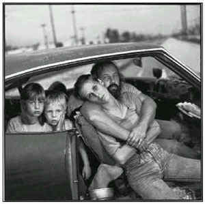
The composition of his work allowed us to see the deeper meaning that he was intending.


End Notes:
Photo 1 - http://www.danthewoodsman.com/wp-content/uploads/2008/12/800px-walker_evans_1937-021.jpg

Quote 1 - http://en.wikipedia.org/wiki/Walker_Evans

Photo 2 - http://www.masters-of-photography.com/images/full/evans/evans_hale_county.jpg

Photo 3 - http://albertoalonso.files.wordpress.com/2009/07/trodd-walker-evans-01.jpg

Photo 4 - http://www.luminous-landscape.com/images2/damage-we.jpg


Thursday, November 12, 2009

Contrasting Forms


The concept of contrasting forms is to get a picture where an object or subject is the foreground of a picture and an object or subject is the background of a picture. This balances the picture out. The first picture of the powerline pole applies to this concept because the powerline pole is the foreground of the picture and the parking meter is the background of the picture. The car behind the parking meter is also a great background to the picture. The second picture of the powerline pole applies to this concept because the powerline pole is the foreground of the picture and the recycling bin is the background of the picture. You could also say that Alastair, Julian and Zaina make a great background for this picture as well. The third picture of the parking meter applies to this concept because the parking meter is the foreground of the picture and the green truck is the background of the picture.


Repetition/Perspective


The concept of repetition/perspective pictures is to get a good shot of objects in a repetative form such as piano keys and telephone poles. The first picture of the windows applies to this concept because the windows are repetative. The second picture of the trees applies to this concept because the trees are repetative. The third picture of the muni power line poles applies to this concept because they are repetative as well. The picture of the trees is my personal favorite because I believe that it shows the greatest repetition out of the other pictures.


Leading Lines


The concept of leading lines is to get a picture of a road, pathway or a line itself and balance it out with the background. The first picture of the alleyway applies to this concept because the pathway is the leading line and the end of the alleyway is the background. The second picture of the sidewalk applies to this concept because the sidewalk is the leading line and the sky is the background. The third picture of the sidewalk by Drew applies to this concept because the sidewalk is the leading line and the traffic lights ahead are the background.


Thursday, November 5, 2009

Contrasting Forms

Nikos
http://images.google.com/imgres?imgurl=http://www.travelphotoblog.com/archives/red.jpg&imgrefurl=http://www.travelphotoblog.com/archives/002895.shtml&usg=__OaxfigN6JFhbnQMO2SuqvIxQosg=&h=263&w=350&sz=38&hl=en&start=65&um=1&tbnid=UwUpt5brMQrcUM:&tbnh=90&tbnw=120&prev=/images%3Fq%3Dforeground%2Band%2Bbackground%26ndsp%3D18%26hl%3Den%26rlz%3D1T4GGLL_enUS300US300%26sa%3DN%26start%3D54%26um%3D1

Natasha Carsberg
http://images.google.com/imgres?imgurl=http://www.sculptureatwattyler.org/uploads/images/sculpture_340x340/dot-nat-carsberg.jpg&imgrefurl=http://www.sculptureatwattyler.org/index.php%3Fpage%3Dnatasha-carsberg&usg=__saglv5_BdWHbZe1hqoyMOQww5Gc=&h=340&w=340&sz=33&hl=en&start=37&um=1&tbnid=kPvl80Iqs6uFiM:&tbnh=119&tbnw=119&prev=/images%3Fq%3Dcontrasting%2Bforms%26ndsp%3D18%26hl%3Den%26rlz%3D1T4GGLL_enUS300US300%26sa%3DN%26start%3D36%26um%3D1

Claire Lewis

Nikos

The concept of contrasting forms is to get a picture where your object or subject is the foreground of the picture and where another object or subject is the background of the picture so it balances the picture out. The first picture of the man at the restaurant applies to this concept because he's the foreground of the picture and the table behind him is the background. The second picture of the statues applies to this concept because one of the statues is the foreground and the other statue is the background. The third picture of the car applies to this concept because the car is the foreground of the picture and the minature car next to it is the background. The fourth picture of the two men applies to this concept because one man is the foreground and the other man is the background.


Repetition/Perspective

Booray Perry
Petteri Lopponen

http://images.google.com/imgres?imgurl=http://farm2.static.flickr.com/1072/1269205825_22d1973d00.jpg&imgrefurl=http://www.flickr.com/photos/8279953%40N05/galleries/72157622418876404/&usg=__4yKYv8rO-4NEIe3h2fn7X3tXPjI=&h=333&w=500&sz=122&hl=en&start=10&um=1&tbnid=GmXJcKLMokrSkM:&tbnh=87&tbnw=130&prev=/images%3Fq%3Dphotography%2Brepetition%2Bwindows%26hl%3Den%26rlz%3D1T4GGLL_enUS300US300%26um%3D1

Jim Miotke


Dianna Paulk

The concept of Repetition/Perspective pictures is to get a good shot of objects in a repetative form such as piano keys and telephone poles. The first picture of the wedding applies to this concept because the chairs are all repetative. You could also view this as a leading line but I see it more as a Repetition/Perspective. The second picture of the windows applies to this concept because the windows are all repetative as well. The third picture of the boats applies to this concept because they're also repetative. The fourth picture of the stair railing definetely applies to this concept because the railing poles are repetative as they go up.


Leading Lines

JB.Me
Rich Legg

http://images.google.com/imgres?imgurl=http://farm1.static.flickr.com/198/457222437_5333a0f9de.jpg&imgrefurl=http://www.photowalkingutah.com/2007_09_01_archive.html&usg=__-4uYY8EhEWW1261y6-LnpI8YfjA=&h=500&w=400&sz=123&hl=en&start=1&um=1&tbnid=9qJ-TIh_nzCeoM:&tbnh=130&tbnw=104&prev=/images%3Fq%3Dphotography%2Bleading%2Blines%26hl%3Den%26rlz%3D1T4GGLL_enUS300US300%26um%3D1


Gail Bjork


Kevin Utting

The concept of leading lines is to get a picture of a road, pathway or a line itself and balance it out with the background. The first picture of the hallway applies to this concept because the floor is the leading line and it balances itself out with the door. I also enjoy the glass that surrounds it. The second picture of the road applies to this concept because the road itself and the line on it are the leading lines and they balance themselves out with the forest. The third picture of the man walking down the beach with his dog applies to this concept because the lines on the beach are the leading lines and they balance themselves out with the ocean and the sky. This picture is my personal favorite because of the scenery. The fourth picture of the outdoor pathway applies to this concept because both the pathway itself and the lines on it are the leading lines and they balance themselves out with the ocean and sky.


Thursday, October 29, 2009

Halloween


One spooky day at Drew College Preperatory, a young boy named Isaac was finishing up his homework in the photography classroom. Once he finished, he made one last look around to make sure he didn't forget anything. He then turned off the lights and walked out of the classroom. A couple of seconds later he realized that he left his backpack cramped under Mr. Whiton's desk. As he walked back into the classroom to retrieve it, a mysterious figure stood before him. Isaac was in deep shock when he discovered this figure. Where did it come from? So Isaac immediatly ran out the door and today still doesn't believe that actually happened.


Friday, October 16, 2009

One, Two, Three (Extra Credit)

The concept of one, two, three is to be able to get a three vertical stripe formation in your frame. This particular photo of Cal definetely applies to this concept because you can see him in one vertical stripe, the white pillar in a second vertical stripe, and the front door of the house in a third vertical stripe.

Tuesday, October 13, 2009

Rule of Thirds


The concept of the rule of thirds was to get a picture of a subject in a "tic tac toe" format. What I mean by that is that you put your subject in one third of the frame and balance it out with two thirds of the frame. This could mean that you put your subject in the corner of the picture, to one side of the picture, etc. I also applied this concept to regular objects as you can see above. The picture of the Drew College Preperatory restroom sign applies to this concept because it's off in the right portion of the frame which balances out the rest of the wall. The picture of the courtyard lights applies to this concept because its at the bottom portion of the frame which balances out the rest of the sky. The picture of James sitting on the courtyard bench applies to this concept because he's off to the left portion of the frame which balances out the rest of the courtyard. The intense glare that he gives in this particular picture also draws more attention towards him than the rest of the picture. The picture of Julian with his arms crossed applies to this concept because he's off to the left portion of the frame which balances out this particular part of the courtyard. I personally like this picture the best because the metal bars next to Julian contribute a great effect to the picture. The picture of Cal standing in front of the church applies to this concept because he is standing in the left portion of the frame which balances out the church. Originally all of these pictures were bigger in lengh and width but I knew that trimming them down in photoshop would make them apply to the rule of thirds concept even more.


Friday, October 2, 2009

Cityscapes


The concept of cityscapes was to walk around outside of the school and take pictures of interesting shapes that caught our eye. The picture of the volks wagon headlight was a very interesting rounded shape to me that I believed worked for this concept. The picture of the black fence in front of the surrounding house was the best example of this concept in my opinion because of the way that parts of the fence curved up so gradually. The picture of the ford logo I found was an excellent shape to do, not just the outside ring, but the letters themselves had magnificent shapes to them.